|
|
| photo: Brent Taylor | |
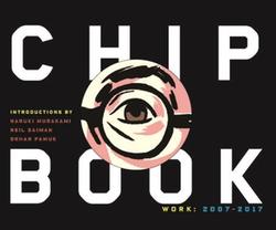
Chip Kidd is a graphic designer and the associate art director at Alfred A. Knopf. He is also a novelist, graphic novelist and editor, among other occupations. Chip Kidd: Book Two, collects examples of his work from 2007 to 2017--the first volume covered his career from 1986 to 2006--and features captions and essays about a variety of his projects, including his iconic book covers. The book also features introductory essays from Haruki Murakami, Neil Gaiman and Orhan Pamuk.
Your book goes into this a little bit, but could you elaborate on why/how design trends develop, especially when it comes to book covers?
The boring answer is I have no idea. I do what I do and make my design choices very intuitively, and yet however independent I think I am, I find that sometimes I am following the herd, totally by accident. However, warm yellow works for a very good reason, and it's not like I'm going to drop that option if it seems appropriate to the book at hand.
What are some book cover clichés that you wish you could ban?
High-heeled shoes, beaches, the backs of women's/girl's heads, "three-dimensional" typography, dragons, puppies, pasta, kittens. But, hey, never say never.
Many female writers have complained that they're given covers that pigeonhole their work as "women's fiction." Should it be a function of book covers or graphic design in general to suggest an intended audience (at the possible cost of broader appeal)?
Absolutely NOT. One of the phrases that is used routinely in this business that I really hate the most is "Target Audience." Whenever someone invokes that, I cannot help but say: "The people in our audience are NOT targets; we are not aiming guns at them. They think for themselves, let's just do the best job we can." I would say the female writers you cite are quite justified in their anger. You don't see Alice Munroe or Lorrie Moore being pigeonholed in this way, and neither should anyone else.
What are some recently released book covers that you particularly admire?
By me or other designers? Re: me, I am particularly proud of what I've been able to do for Haruki Murakami, especially the last four books or so. Ditto astronaut Scott Kelly's forthcoming memoir Endurance--I wish that could have made it into Book Two, but there wasn't time or room. Re: other designers, I am always in admiration of what Kelly Blair, Oliver Munday, Paul Sahre and Rodrigo Corral come up with. Lots of others, too, just can't think of names right now.  How do you deal with the rejection and disappointment that seems inescapable in your field? Your book provides many examples of fascinating concepts that just didn't work for authors or publishers.
Look, it hurts--that's why it's called rejection. But it's part of the job and pointless to dwell on it. You have to see it as an opportunity to do something better. I think what helps me deal with it is that I have been doing this for so long, I have enough "successes" under my belt that I can absorb whatever hits that come. If everything was getting rejected all the time, well, that would be a suggestion that I've reached my sell-by date. Not yet, but who knows?
You touch on this a little in the book, but how does your design process change when dealing with difficult political or racial issues? Have you declined work that you disagree with on moral or political grounds?
Very good question. The short answer is that, no, I have never been asked to design a book cover for a work to which I was morally opposed. I would refuse such a request. Luckily, Knopf and I seem to be aligned in this way, and have been for 30 years and counting.
Your craft is often in the service of other people's projects, working behind the scenes. Is it hard putting yourself front and center in a book like this? What's it like to be the object of critical attention?
I am narcissistic enough that I don't mind putting myself front and center (in this case), as you say it, but I also try not to take myself too seriously. That said, there is no denying that the very act of publishing a book like this is to declare: "Wow, can we believe how great I am?" But I also think that if I don't collect and record all this work in one place, no one else is going to. And if it inspires a designer or two in the process, so much the better.
There's a lot of variety to your recent work. Do you ever decline any requests out of concern that they're just not in your wheelhouse?
Every now and then, but it rarely comes up. When it does, I pass. As in, you will not see any "Self-Help" covers in Book Two, and only a few "financial advice" covers--which I did when I felt I could lend something conceptually to the projects.
One of the things I liked and appreciated about the book was that Alan Moore and Frank Miller were featured alongside Orhan Pamuk and Haruki Murakami. You seem to have such a diverse world of influences and collaborators. Looking back, do you think there are any common threads that tie your objects of admiration together?
Thank you--I have been so lucky to work with such a diverse group of writers and cartoonists who come from so many unrelated backgrounds. I would say the common thread is that they're all great at what they do, and I just hope I can contribute in some small way to that. --Hank Stephenson, bookseller, Flyleaf Books

