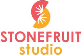
Associate Creative Director Erin Fitzsimmons on designing the Stonefruit Studio logo:
 |
|
Design began with the imprint name itself. I was inspired by the incredible variety of stone fruits—peaches, olives, raspberries, plums, lychees—each with its own textures and colors. That diversity felt like the perfect metaphor for an imprint committed to bold, innovative storytelling and fresh new voices. In my research, I explored fruit shapes and terrazzo patterns, which offered a playful double meaning: fruit fragments that also resemble stones.
The greatest design challenge was striking the right balance between youthful freshness and graphic sophistication so the logo could flex across all ages: from board books to YA and graphic novels. The dual-slice structure also echoes the partnership at the heart of the imprint, a visual nod to Mabel and Ben’s shared creative vision. My hope is that our authors and illustrators feel happy, inspired, and emboldened when they see it—a symbol of a creative team dedicated to supporting bold ideas and taking chances together!

