 |
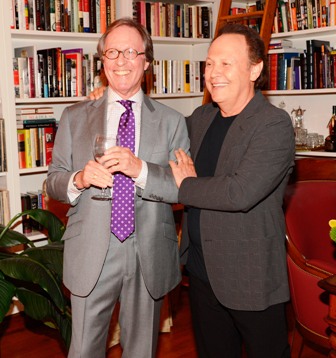
| photo: John Madere |
For 26 years, Chip Kidd has been designing book covers for Knopf--books such as Michael Crichton's Jurassic Park, one of the most recognizable covers in the world. Now he's created a visual guide to graphic design, for kids from 10 to 100, introducing "ideas that I didn't start considering until I was in college," he says. Here he discusses his thoughts about Go: A Kidd's Guide to Graphic Design (Workman, October 8, 2013, reviewed below). Kidd lives and works in New York City.
When did you know you wanted to be a graphic designer?
I was first drawn to comics, and becoming a cartoonist. After a while I came to understand I wasn't talented enough to do that well. By that time I was a freshman at Penn State. I had a really great guidance counselor who said, "There's this thing called graphic design."
What were the seeds of this project?
This project came about thanks to Raquel Jaramillo [aka R.J. Palacio, the author of Wonder]. I'd known her professionally for years; she did what I did. She asked me to lunch one day, and she laid this idea on me: "I think someone should do a book on graphic design for kids, and I think it should be you." Then I had to figure out what it was going to be.
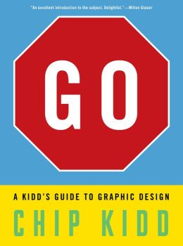 Do you see its audience as children? Adults? Both?
It had to be something that a 10-year-old could at least understand, but these are all ideas that I didn't start considering until I was in college. Even though it's for "children," it would still introduce concepts that, frankly, in and of themselves are sophisticated. The question for me was how far to go, and what's too much to take in as an introduction.
One of our favorite lines in the book is the statement, "Everything that is not made by nature is designed by someone." You print it in all capital letters, which you state later in the book is equivalent to "shouting."
Until you have to try and make some of this stuff, there's a tendency to think that it just sort of happens, or that you don't take into account you have to think of it or do it. This is sort of a side tangent, but after I wrote a book, I started thinking in terms of writing and critiquing: I don't think a critic is qualified to do something until they've tried it themselves.
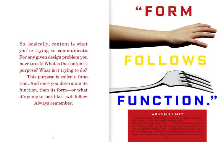 We especially enjoyed, on that same page, your point that the milk carton's design was inspired by nature.
That's kind of hilarious. Let's make a milk carton that looks like a cow. It's considering the source of the material and following from there logically.
Did you create the 10 projects at the back as a way for kids to put into practice the concepts you introduce in the book?
Raquel had a lot of input on that. That's part of what made her a terrific editor. Even though I'm into a lot of stuff that they're into, I don't have kids. I don't especially like kids; I don't understand them. She helped me develop a voice to talk to them. We were originally going to do five projects, and it kept growing and growing. We wanted to finish the book with, "Okay, now take this information and contribute to society with it." The best single example of that is the iconic "I heart New York" image from Milton Glaser.
Did you have certain graphic design milestones you knew you wanted to cover in Go?
I had thought about a lot of this stuff already with my first novel, The Cheese Monkeys. The intended audience [for that book] is adults, but how do you turn the graphic design process into a narrative? How do you make people who aren't in the field understand these things? That's prose. Now we're going to make it into something visual, because that's what Go is about--visual ideas. I didn't think about "What did I want to know when I was 10 that I didn't know?" It was more about, "Let's introduce someone to this, no matter how old they are or no matter how much they think they already know about it."
You take into account context in your design, too, as when you describe wanting to make Batman: The Dark Knight Returns by Frank Miller stand out in a comic book store.
Now more than ever people are seeing books for the first time the size of postage stamps on an illuminated screen. When I first started--and I'm the last generation of designers to learn before the computer came along--one of the lessons I was taught, was that you first design something very small. If you design something much smaller than it's supposed to be, and it works at that size, then when you blow it up, it will also work.
The Book-of-the-Month Club, for years, took the back page of the New York Times Book Review. That was how a lot of people bought books. All the covers were reduced to the size of a postage stamp. Sometimes, whoever was designing that ad would take liberties, because you couldn't read the covers, plus they had to be black and white, and they had to be pixilated. If no one ever sat me down and said, "This has to look good in the BOMC ad," I might not have learned that lesson.
We liked that you admit your mistakes, such as the cover for The Shock of the New by Robert Hughes, the art critic.
My standing lecture for the last year has been called "Failing Better," one thing I didn't get into in my TED talk. That would be a completely different lecture to give, the importance of failure, and the importance of bouncing back from it. You have to look at it as an opportunity to do something better. That's very important in design. --Jennifer M. Brown
 In a move that "has brought confusion to the prospect of the company bringing 300 jobs to town," Amazon officials have withdrawn their request for tax abatements and reduced building permit fees in Windsor, Conn., where the online retailer had "proposed building a 1.5 million-square-foot distribution center on Day Hill Road," the Hartford Courant reported.


BINC.0325.T2.SUSANKAMILEMERGINGWRITERSPRIZE.jpg)
 After 38 years in business,
  Kobo is partnering with the
  Next week, for the first time, National Book Awards longlists will be revealed by the
 "Not many Oswego students know that just a short bus ride away from campus there is a
  Author
  "Did you hear the happy squeals coming from the Joule Hotel last week?" asked Joy Tipping of the Dallas Morning News, referring to her first glimpse of "the
  The American Way of Poverty: How the Other Half Still Lives
 Do you see its audience as children? Adults? Both?
 We especially enjoyed, on that same page, your point that the milk carton's design was inspired by nature.
 Book you've bought for the cover: