 |
| Jamiel Law |
Jamiel Law is an illustrator, painter, and creative thinker. He was born and raised in Sarasota, Fla. He strives to create honest work that resonates with others and establishes a genuine connection. When not at his desk, Law can be seen lounging around with his family or hooping at a local park. Last week, Law won the Coretta Scott King/John Steptoe Illustrator Award for his debut picture book as illustrator, Jimmy's Rhythm & Blues: The Extraordinary Life of James Baldwin (HarperCollins), written by Michelle Meadows.
Jimmy's Rhythm and Blues is a beautiful book--how do you feel about your work being recognized in this way?
Thank you for the kind words! Although I strive to create work that connects with others and that I'm proud of, I never would've expected this level of recognition--especially in my first book! So, I'm a bit taken aback to say the least.
How do you describe this book to people unfamiliar with it?
It's an honest, thoughtful, spirited, exciting biography about the life and impact of writer and activist, James Baldwin.
I imagine that illustrating a work of nonfiction must be different than illustrating a work of fiction--you must get the settings, clothing ensembles, and details correct, not to mention replicating real humans who lived. What kind of research did you do for this book? How did you match your work to the time?
Oh absolutely. That's what made it so challenging, but I think it made it all the more fun, too. I started by watching documentaries about Baldwin and about the general time (roughly the 1920s to 1980s) just to get an overall sense of place--the textures, clothes, hairstyles, people, and architecture. From there, I then filled a digital mood board with a TON of references of all those things mentioned above. Because my book would include familiar faces in poses not photographed, I hired some friends and family to pose in a studio so that I could gather the anatomical and lighting information to really ground these characters into space. Also, I can be a massive overthinker, so all this groundwork was necessary for me to really focus on the drawings and how I wanted to tell this story visually.
You stick to a palette that mostly features browns, tans, greens--how did you choose this palette and why did it work for you?
I thought those colors were so vital in describing the city that served as not only the backdrop of the story but also the muse of such an influential writer and activist. So, I think it's cool that those warm colors carry that familiarity and that feeling of inspiration through the writer's life and travels. It's another way to remind us of his constant thoughts of home throughout his life--thoughts that would bring him back at a point.
One double-page spread, though, is almost entirely black and features a close-up of Baldwin's face. It's a shock of a page turn, utterly captivating. What was your inspiration for this image? How did you feel when creating it?
When I read the manuscript, that was the first image that came to mind. It describes the anger and the rage that bleeds from the writer's thoughts of the injustice taking place in the 1950s and '60s in the U.S. It was clear to me that a level of pain would have to be evident and that I really had to feel something when I saw this page. It made the most sense to me to pull the reader uncomfortably close to the character. You're close enough that his glaring eyes can stare directly into yours in a confrontational manner or in a way with which you can empathize.
 How did you feel when you were approached to illustrate this picture book? What did you think of the text? Did you already feel a connection with Baldwin?
I thought that it was a huge honor. I read the manuscript and was blown away with how Michelle Meadows weaved his story together with the pen. And, seeing that no prior picture books of this magnitude had ever been created to chronicle and celebrate his life, I was nervous to say the least.
And honestly, I felt a great sense of self-doubt because Baldwin and his writings were such a huge benchmark in my studies of African American history. So, to illustrate a picture book telling the story of such an impactful person, it felt GRAND and beyond me.
Thankfully, the confidence and trust given to me by my agent (Steven Malk), editor (Luana), art director (Dana), and the author (Michelle) really empowered me to push through those emotions and to focus on the creation and fun of the work.
Is there an image that you found particularly difficult to illustrate? Anything that came to you immediately?
The spread that I found the most difficult to illustrate was Jimmy and Beauford talking in Beauford's Greenpointe apartment. I know I wanted a lot of information in the shadows, so it took me a while (and an entire redraw) to figure out the values and the color.
The images that came the fastest to me were the closeup of Baldwin's face and the spread where he is writing on the typewriter. Usually, the ideation and compositional aspect of illustration takes the longest, so I was very relieved when these images basically jumped from my brain onto the page.
Are you hoping to illustrate more picture books? Are you working on anything now?
I would love to illustrate more children's book, both nonfiction and fictional. And yes, it's funny that you ask that. I'm wrapping up another book at the moment written by the talented Teresa Rodriguez, about a Black family's story of growth and resilience told from the perspective of a pecan tree growing alongside each new generation. It's releasing spring of 2026 with Atheneum, and I am extremely excited.
Is there anything you'd like to say to Shelf Awareness readers?
Thank you for your support! It's truly the work that you do that allows amazing stories to be amplified and to connect to and to inspire others.


 Watermark Books & Cafe in Wichita, Kan., has been put up for sale. Sarah Bagby has owned the store, which opened downtown in 1977, since 1996. Describing the development as "a shocker," the Wichita Eagle reported that Bagby has seen substantial interest since listing Watermark for $247,400 (not including an approximately $250,000 inventory) with Todd Bailey, president of Transworld Business Advisors of Wichita.
 Penguin Random House, Hachette Book Group, HarperCollins, Macmillan, Simon & Schuster, Sourcebooks, authors Malinda Lo, David Levithan, and Dashka Slater, and others have filed a lawsuit in Idaho challenging the book removal provisions of a law signed last July that restricts books in public and school libraries. The Idaho law, called HB 710, forbids anyone under the age of 18 from accessing library books that contain "sexual content," regardless of the work's literary or educational merit; the law's definition of sexual content is "broad, vague, and overtly discriminatory," the plaintiffs said.
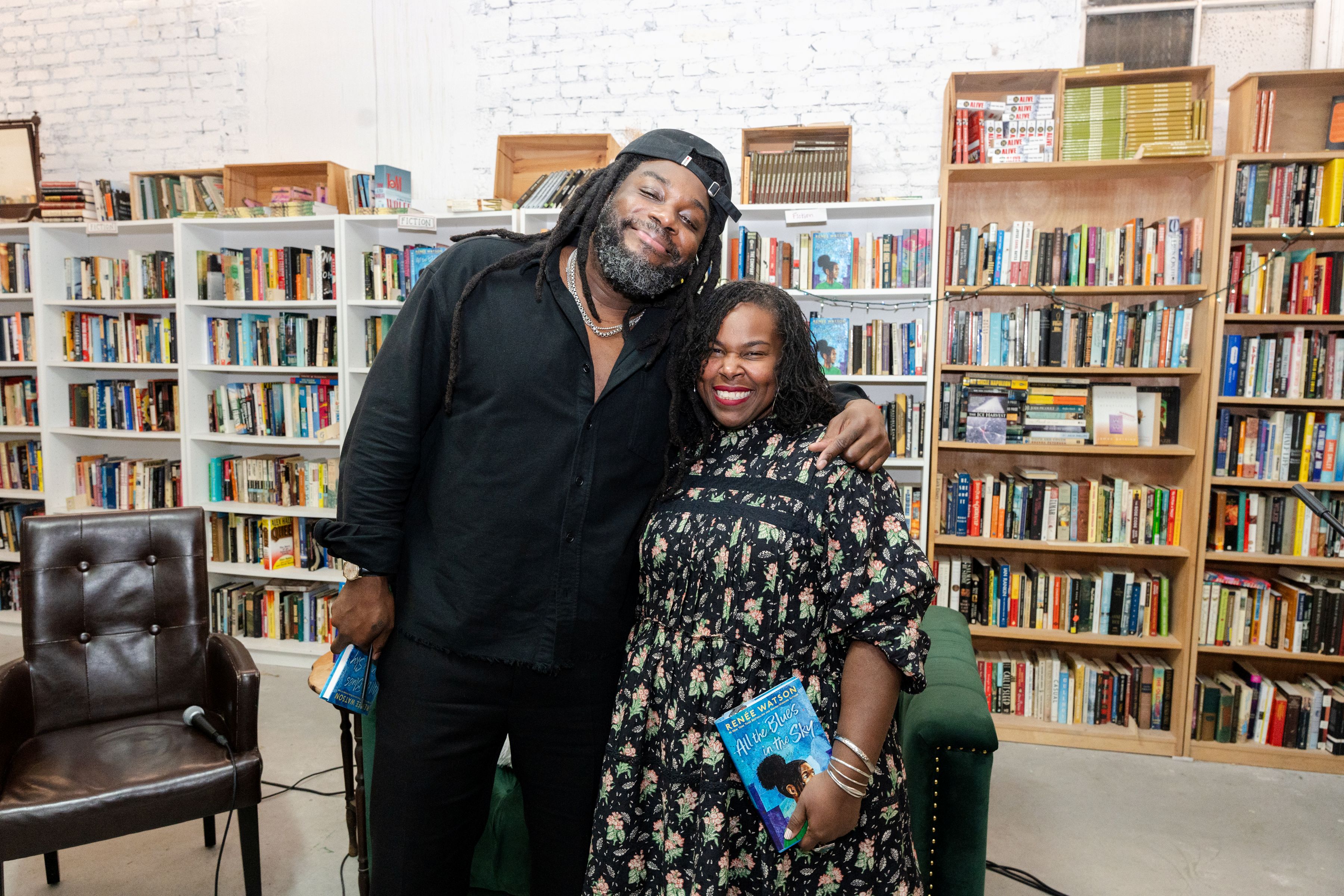 Renée Watson was in conversation with Jason Reynolds (who recently won the
 It's Getting Hot in Here: A Novel
 Book you're an evangelist for:
 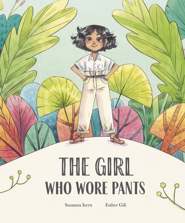 This spirited biography by Susanna Isern (The Voice of the Forest), translated from the Spanish by Cecilia Ross, pays tribute to changemaker Luisa Capetillo (1879-1922), who dared to challenge convention and gender norms by fighting for women's right to wear pants.