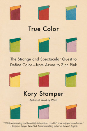
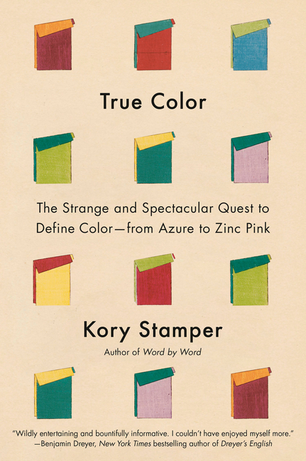
 In True Color: The Strange and Spectacular Quest to Define Color--From Azure to Zinc Pink, lexicographer Kory Stamper demonstrates a marvelous instinct for storytelling as she uncovers the curious history behind the entrancing color definitions in the dictionary. She explains in today's feature how her coffee-break activity of reading these colorful entries transformed into a yearslong quest to learn more about the people who wrote them.
The Writer's Life
Kory Stamper: The Language of Color
|
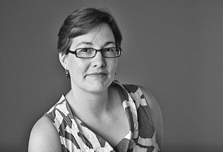
Kory Stamper
(photo: Michael Lionstar) |
A veteran lexicographer with a marvelous instinct for storytelling, Kory Stamper is the author of Word by Word: The Secret Life of Dictionaries. Her writing has appeared in the Guardian, the New York Times, and the Washington Post. Stamper's second book, True Color: The Strange and Spectacular Quest to Define Color--From Azure to Zinc Pink (Knopf; reviewed in this issue) uncovers the curious history behind the entrancing color definitions in Webster's Third New International Dictionary.
What was the impetus behind True Color?
It began when I stumbled across a definition for the color "begonia" in Webster's Third New International Dictionary. Even though I was well familiar with the types of definitions found in the Third--I had been trained on the style guide used to write the Third when I worked at Merriam-Webster--I had never seen anything like these. They became my coffee-break activity when I needed a break from defining or proofreading. The definitions were so serious and scholarly yet whimsically bananas that I had to know more about the people who crafted them. And the more I discovered about them and the other work they were doing, the deeper and more involved their stories became.
 What were the challenges in bringing their stories to the reader?
Many of the people involved in the color defining for the Third were scientists, and I am decidedly not: I'm just a humble lexicographer. These scientists were also working during a period when color science was growing by leaps and bounds. So to be able to understand why they were defining the way they were, I had to delve into color science--a field that is just as abstruse and opaque as lexicography, but with more math.
Then there was the problem of record. Many of the things I was researching were buried in corporate or private archives that required special permissions to access. Some of the records I could access were incomplete; people only keep the papers that they think are worth keeping, not the papers that some researcher might need 80 years down the road. And some of the people I was most captivated by weren't big-name scientists or lexicographers with a collection of papers housed in an archive, but people who worked behind those big names, in the shadows, and kept the whole machine moving forward. It took me almost a decade to sift through all these records, tugging at the thinnest of threads in the hope that it would lead me to another source, more information, a fuller picture.
There is a gap between how scientists, artists, and the public talk about color. Have there been any recent coordinated efforts across disciplines to unify color language? Should there be?
It seems like there's always a push for some sort of universal color language across color-related fields! I'm currently an adviser to a group that is working on a color literacy curriculum for elementary and secondary schools, and we spent a lot of time talking about the "core" color vocabulary to use--in part because we knew that, as those students grew up and moved into the wider world, they'd encounter a lot of other types of ways to talk about color: warm and cool, saturated or unsaturated, dark or dull or muted or grayish, Munsell or NCS or Pantone, ad infinitum. The goal is to give students the ability to translate between disciplines.
And yet. Trying to force the rudder of common usage and turn the ship by yourself is folly. No matter how many color educators, color scientists, painters, industry folks, or theorists holler from the rooftops that "the primary colors" are not red, yellow, and blue (or, not just red, yellow, and blue--there are many sets of primary colors!), people will nonetheless grab the red, yellow, and blue crayons when you say "primary colors." Linguistic change is often much slower than we'd like it to be.
Do our preferred colors change with age or life situation? What are your current favorites?
We are, for the most part, curious creatures who live in a changing world, so it's inevitable that we're influenced by trends, psychology, our surroundings, and even our own bodies when it comes to color. My favorites have certainly changed over the years: my currents are deep pumpkin oranges, those deep blue-greens, and those chartreuse yellowish limes. (Yes, chartreuse is a green!)
What is the secret to improving our ability to match colors and finishes?
For most of us, it's trial and error, but in general: you can start by matching colors on similar finishes or materials (so, fuzzy sweater to pants instead of fuzzy sweater to shiny car). I also play a color-matching game on my phone when I'm flying to distract me from the possibility I might fall out of the sky; they can be fun and I have found that my color-matching ability has gotten better.
Do you use the black-and-white and sepia photo filters on your phone camera or are you firmly in the color photo camp?
I am firmly in the color camp, though that's increased as I've appreciated how much colors interact with each other. And I've come to appreciate how difficult it is to use black and white to best advantage: when you remove color from a picture and all you have to work with is the value scale, it requires a different kind of engagement with whatever you're photographing. All respect to the black-and-white photographers out there.
Writing about new colors, you mention the ultra-white paint created at Purdue University in 2020 that has yet to be named. What name would you give it?
This is a paint that is so reflective that it has a cooling effect on buildings, so it would be tempting to head in that direction: "Refrigerator White," "Coolest White." But I like the idea of honoring the mechanical engineer who created it, so I'm going with "Ruan White."
What is the one thing you now know about color that you wish you had known earlier?
It sounds ridiculous when you say it, but it's true: color is everywhere and in everything. The natural world is full of color, of course--even things we think of as colorless, like air, can take on a color depending on the atmospheric conditions, the time of year, whether there's dust or pollen in the air, how much water vapor is suspended, and so on. Everything in the built environment has a color that has been chosen, created, enhanced, applied, tested, retested, reapplied, and then distributed. The white paper in your printer is not naturally that color; that color has been chosen and engineered for that specific kind of paper. When you realize that everything we see involves color--something so common yet so difficult to wrangle or wrap our heads around--you have to marvel. --Shahina Piyarali


PHICTLY.0703.TX.LIVEVIRTUALAUTHOREVENT3.jpg)

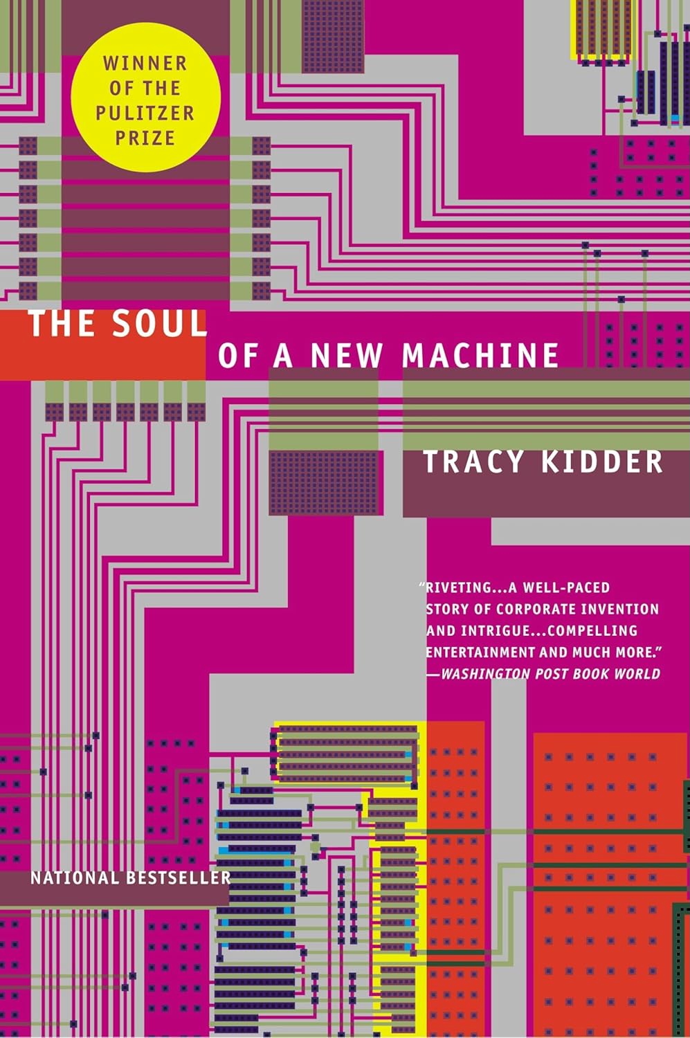 Tracy Kidder, "a wide-ranging journalist and author whose deep reporting and novelistic prose illuminated worlds as diverse as home construction, disease prevention and--as portrayed in his prizewinning 1981 breakthrough book, The Soul of a New Machine--the computer industry," died March 24, the